This Tip & Trick will provide you with a convenient tool to visualize and analyze transfers in your model utilizing the BICON extension. The Tableau workbook and the preparatory Excel file are provided in the download section.
Introduction to the Transfer Graph
The Transfer Graph is a Tableau workbook with a preparatory Excel workbook that allows you to visualize and analyze transfers from any INOSIM model.
![]()
Exemplary Transfer Graph
In this visualization, every unit is represented by a node on a graph. Units that have a transfer between them are connected by a line. The color and thickness of the connections can be determined by a set of properties, e.g., the number of transfers between the units or the total mass transferred.
On the right hand side, a timepoint in the simulation can be chosen. The filling percentage of the nodes will represent the filling level of the units at the given point in time. Hovering over a unit will reveal a tooltip with some general statistics, the filling level and a Gantt chart of the transfers that happened around the selected timepoint (marked with a red line).
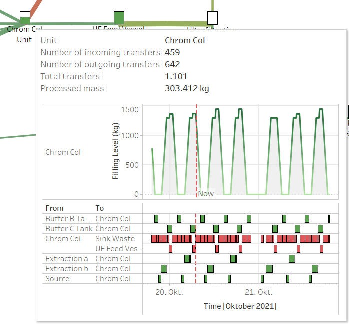
Unit Tooltip
Similarly, hovering over a connection will reveal the general information as well as a timeline of the transfers around this time point.

Connection Tooltip
Finally, you can also return any metric as a highlight table by clicking the Show Transfer Chart button on the right-hand side:
![]()
Transfer Chart, displaying the number of transfers between units
Both the Transfer Graph and the Transfer Chart can be filtered arbitrarily.
Creating the Transfer Graph
Now that you know what the Transfer Graph does, let´s look at how you can create one from your own model.
As a first step, simulate the model you want to create the Transfer Graph for. Make sure to export the simulation results with BICON while having the setting for Transfers (dynamic) active. You can find the setting by navigating to Tools -> BICON -> Units in INOSIM.
![]()
BICON Configuration
Next, download the Transfer organizer.xlsm and Transfers – VBA prepared.twb from the Downloads section. If you are not comfortable downloading and using an Excel Workbook with Macros, you can alternatively download the Transfer organizer.xlsx and the Transfer organizer code.bas separately. After reviewing the code, you can import the module. For the code to run, you’ll then need to activate Microsoft ActiveX Data Objects 6.1 Libary in the Visual Basic Editor under Tools -> References.
The Transfer organizer is an Excel Workbook with a macro that will link your simulation data to the Tableau workbook and also generate an initial distribution of nodes based on the interaction of units. You will only need it for the setup – as long as no units are added, you can simply resimulate your experiment to update the final Transfer Graph.
Since Windows blocks files with macros by default, as they can potentially be harmful, you’ll need to manually unblock these files. Right-click the Transfer organizer.xlsm, select Properties and check the Unblock checkbox at the bottom, then click OK.
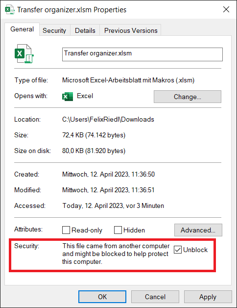
Unblock Macros for the Transfer organizer
Opening the Transfer organizer Excel file, you will see the following:
![]()
Transfer organizer
Ensure that the macros are activated and enter the path to the simulation results and the downloaded Tableau Workbook in the fields. You can provide either the path to the folder or the full file paths. To get the path to the INOSIM_UnitTransfers.csv, select Open storage location in the BICON Explorer in the context menu of the export you want to use and copy the path.
Then, click on the button Prepare Tableau Workbook. In this example, the Paint Factory model that comes with BICON was used. The Transfer organizer will now calculate an initial distribution of nodes, where interconnected nodes are placed close, while unconnected nodes are placed far apart. For large models, this process can take several minutes, during which Excel will seem unresponsive. Once the calculation is finished, you will see a message box confirming that the .twb file is prepared.
In the folder where your Transfers – VBA prepared file was located, you will now see a new Tableau Workbook named Transfers – Preparation finished. Open it up to look at the Transfer Graph that was created.
Adjusting the Transfer Graph
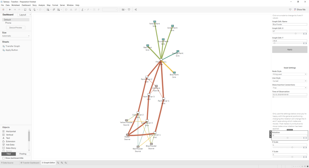
![]()
Initially generated Transfer Graph
Since the general look of the graph is decent and only minor changes are needed to make it look good, this initial distribution will be used. Alternatively, the macro in the Transfer organizer could be rerun to get a new initial distribution of nodes. In the Settings tab, parameters for how the graph should be created can be adjusted, so feel free to play around with them!
To adjust the node positioning of the graph, switch over to the Graph Editor Dashboard. Here, click on a node you want to move. On the right side, you’ll see the node name and the current X and Y coordinates. Change the coordinates to the desired location and click on Apply.
Transfer Graph with adjusted node positions
Now that the nodes on the bottom are tidied up, the graph should be rotated so that the sources are on the left and the sinks on the right side. This is possible with the rotation setting on the bottom of the right hand side. Note that the rotation also rotates the X and Y axes, so make sure to get the placement finalized before you apply it. The setting for X and Y scale allow you to stretch the graph along the unrotated X and Y axes. Here, the Y Scaling was set to 1.25 to better fill the space. You can also use a negative value in the scaling to flip the graph. Please be aware that high values for X or Y Scale may cause a broken view.
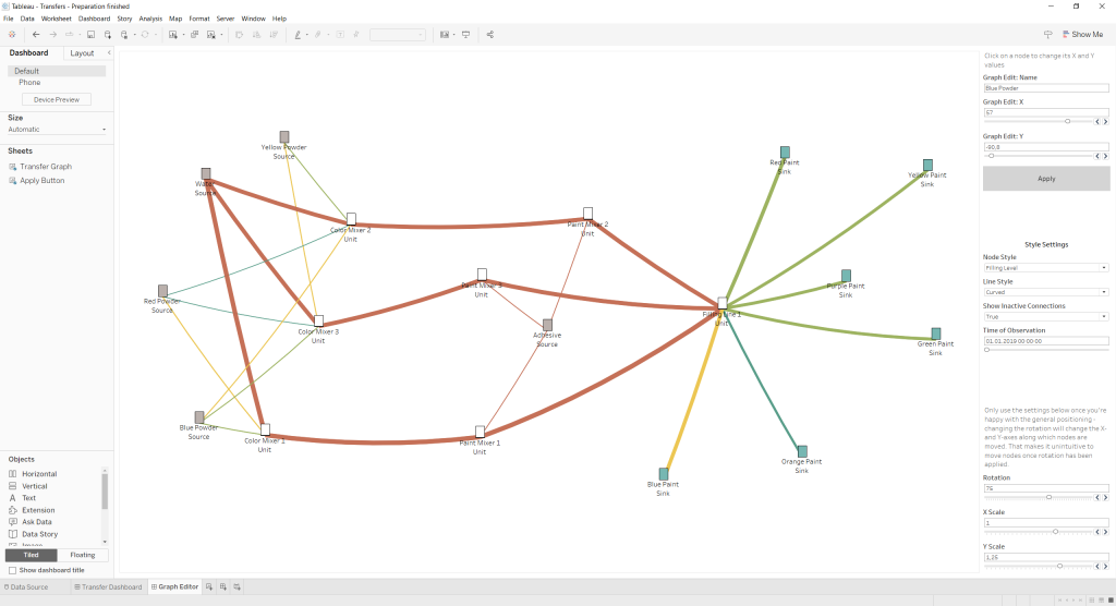
Finalized Transfer Graph
If desired, the style options in the Transfer Dashboard can now be changed to further customize the visual and gain more insights – e.g., that while all Paint Mixers had the same amount of transfers, the ones processed by Paint Mixer 1 were larger, which is because it was the only one processing Red Paint, which had a larger batch size.
And that’s it – now you know everything to get started on your own model!
(for registered INOSIM users)
- Excel Workbook with a macro that will link your simulation data to the Tableau workbook
- Excel Workbook (without a macro) that will link your simulation data to the Tableau workbook
- Prepared Basic code file for the use in this Tip & Trick
- Prepared Tableau file for the use in this Tip & Trick
- PDF printout of this Tip & Trick
More Questions?
Want to know more about this topic or have another question? Please contact us!
More Tips & Tricks
Transfer Analysis with Power BI
In this tip and trick, the Transfer Analysis dashboard is introduced. It is an extension of the Power BI standard dashboard that allows you to…
Two Ways Of Simulating Unit Failures
In your INOSIM project, you can integrate unit failures to represent reality even more precisely in your model, as failures might have a great impact…
The Reporting Object
The Reporting Object With INOSIM 12, the Reporting object was added to the INOSIM object library. The Reporting object provides extensive options to create and…