Visualizing and analyzing process and production data using specialized tools is not a gimmick. It guarantees production participants full insight through an increasingly complex, highly dynamic behavior. To fully exploit the capabilities of the Tableau visualization tool in the interests of our customers, INOSIM employee Felix Riedl has been trained as a Tableau Certified Data Analyst. The following report shows how our expert can support decision makers in future business decisions through data visualization.
Tableau Certified Data Analyst is the highest level of training for external Tableau users. As of now, INOSIM offers the widest possible support for data analysis and data visualization, both for the BICON and Foresight extensions as well as for other use cases. Among other things, we can support you with the following:
- Data preparation (e. g., the preparation and linking of informal or inaccurate data); simulation and real data (e. g., real measurements from a plant, start and end data of processes, level data) can thus be compared against each other. This makes it easy to validate simulation results.
- Professional exploitation of Tableau’s full functionality to create visualizations (such as using calculated fields, table calculations, parameter filters, actions, and interactive dashboards)
- Working directly on the Tableau Server (for example, automated email notification in case of failures or delays in live operations, predefined views for employees)
Sophisticated Visualizations
With the new skills, INOSIM goes beyond the level of Tableau out-of-the-box visualizations (e. g., Gantt charts), allowing for significantly more complex, highly specialized visualizations. An example is the Transfer Graph application shown in the following image (visit our Tableau presentation page for a more detailed, interactive view):
![]()
Units in the simulation are shown here as nodes. Units that interact with each other via transfers are connected by lines. The nodes show the properties of the transfers. The relevant information is displayed for each connection. An algorithm in the background arranges the nodes. The visualization can be adjusted and changed afterwards to display exactly the desired information.
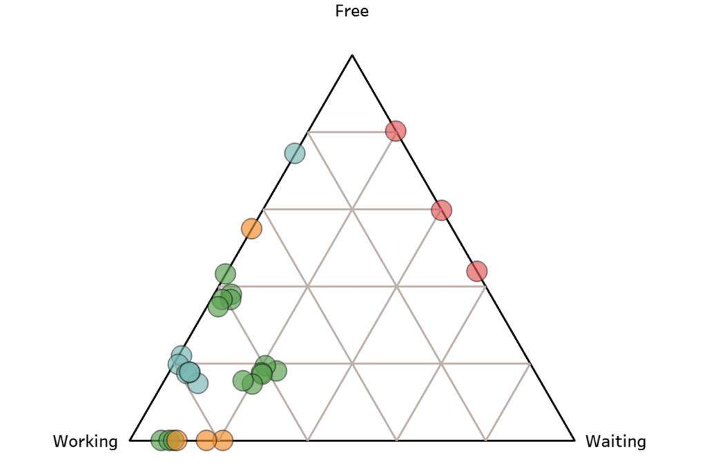
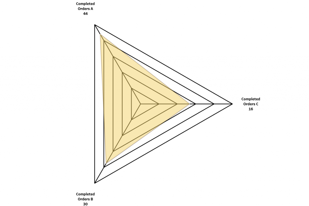
Such complex visualizations can be created by INOSIM according to the needs of the BICON customers and subsequently used by the customers. The following images show further examples of sophisticated visualizations: Ternary diagram, radar chart, display of simulation data on the plant layout.

With these new possibilities, INOSIM is ready to create professional visualization and data analysis for the benefit of our customers. Our Tableau Certified Data Analyst Felix Riedl gives the appropriate motto: “Our aspiration is to be in the top tier of Tableau users. We push the limits of what is possible to help our customers optimally. ”
Do you have any questions or would like to know more about this topic? Please contact us.